Your landing pages are ground zero for the success or failure of your digital marketing campaigns. Landing pages present great opportunities for gathering information about prospects and converting them into leads using attractive offers, such as white papers, eBooks, demos, and proposals.
But how do you know if your landing page is effective? Are you seeing any conversions? If not, then it probably needs improvement. If you're not sure, then we should talk about your landing pages.
Whether you’re seeing some conversions or not, here are 27 little things you can do to improve your landing pages. We’ll take these one at a time from easiest to most complex.
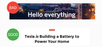
1) Write Better Headlines
Does your landing page headline introduce visitors to your offer? Your headline should present a clear value proposition to prospects.
If you have a landing page that isn't generating leads, then start by improving the copy in the headings.
2) Align Your Form Length With Your Offer
Your B2B landing page form is where you set the cost of your offer to the visitor. Your visitor is weighing the value of your offer against the amount of information you’re asking for on the form.
If you put in too many fields, then you may drive down your conversion rates because the perceived value of your offer doesn’t align with the amount of information that you’re asking for. Decide on the minimum amount of information you’re willing to accept for someone to have access to your content or offer.
HubSpot reports that 31% of marketers believe 4 form fields is the ideal number for getting a conversion. However, the number can vary depending on the offer. Additional fields can be included to qualify leads for high-value offers, such as free proposals or quotes.
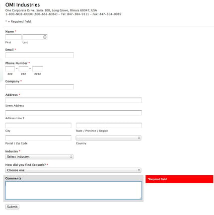
What are the critical pieces of information you need to give away your offer? If your offer is very valuable, such as a demo or free trial, then it could be worth gating more heavily. If you have a top of the funnel offer that you’re looking to get in front of as many visitors as possible, then consider only using the email address field.
3) Segment by Channel
If you can segment based on channel, then you’ll see a benefit. By building in channel segmentation, you’ll be able to identify which sources of traffic are the strongest and which are the weakest.
If you see that your conversion rate from email is very high, but the rate from your pay-per-click campaign is very low, then you’ll want to adjust based on that information. When you focus your efforts on the channels that are converting at the highest rates, this will help push up your overall conversion rates.
If you can, build out landing pages with specific channels in mind. A visitor coming from a LinkedIn advertisement may have different expectations of a landing page than someone who came in through an email. When possible, build your landing pages with the channel in mind.
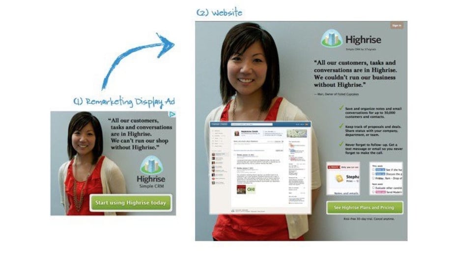
4) Use Conversion Coupling (or Design Symmetry)
Are the methods that you’re using to drive traffic to your landing page aligned with what’s featured on the landing page? This is what is referred to as Conversion Coupling. Your messages in social media, email, advertising, and other platforms should give the visitor a continuity of experience.
When you use symmetry between the design and language of your inbound tactics and the design and language of your landing page, you should start seeing better conversion rates.
The example below gives a clear example of using symmetry between display ad and the landing page that visitors see.
5) Test Your Landing Pages
As with most things, there's always room for improvement in your landing pages. Running basic optimization tests to improve the performance of your landing pages doesn't need to be difficult. Here are 2 methods you can use to test the effectivity of your landing pages:
Running a Split Test
Run a simple split test on the unique selling point (USP) of your landing page. Testing tools, such as those in the HubSpot platform, make this easy. Here's how you do it:
- Create your landing page
- Duplicate it so that you have 2 identical pages
- Change your primary headline, which should be your USP, so that one is short and one is long
- Set up your testing tool to split traffic evenly across the 2 landing pages
- Monitor the performance of each page during 500 to 1,000 unique visits (ideally 1,000 visits to each page will give you a winner)
- Pick a winner
Running A/B Tests
A/B Tests get a little more complicated. Don’t worry about testing colors. Test whether one image is better than another or which headline is better than another. Consider which positioning of the form is better.
Test only one thing at a time or else you won’t know what factor is causing the change in conversion rate. Use your original landing page as the control and build two variations where you adjust a single aspect of the page. When you find the winner between the landing pages, use that page, and then start to test other factors.
6) Keep the Attention Ratio 1:1
How many things do you want someone to do on your landing page? Ideally, your landing page should only want visitors to do one thing. Only give them one path into that thing. Basically, the rule here is: Don’t distract prospects with other options.
A common problem with ineffective landing pages is giving the visitor too many things to do. If you want them to watch a video, put the video front and center. If you want them to fill out a form, consider not putting prominent off-page links on the page. Limit navigation. The focus of the page should be getting people to fill out the form and click the CTA button.
7) Provide Visitors with a Great Offering
Your knowledge and time are valuable. Companies spend a lot of time and resources putting together digital content. When you’re offering a detailed service assessment or consultation, you know that the hours your team spends will add up quickly (and those hours are not free for you).
When you build offers and content that people would be willing to pay for and you give it away for contact information, it can hurt a little at first. However, it will pay off later when you start to turn those conversions and assessments into customers.
8) Write Your Value Proposition Again, and Again, and Again
Have you sold your visitor on the value of converting on your landing page? Or have you just put a form in front of them that they need to fill out to get the content or offer?
Your landing page needs a strong value proposition. This is your chance to entice and persuade your audience. Let them know why your offer will be valuable to them. Give them some sense of what they’ll be getting by filling out the form (or what they’ll be missing if they don’t).
At TSL Marketing, we like to give prospects a list of “What to Expect.” This list clearly states what they will get by filling out the form, including who will follow up, who they will meet with, and what the deliverables and next steps will be.
9) Show Your Visitors that You Care
If you’re looking for sensitive information from people, make sure that you’re telling them that their information is valuable and won’t be misused.
Let them know that you’re going to be a good steward of their information and that their privacy matters.
10) Address Prospects’ Fear of Commitment
Although your visitor is going to want to know the value prop, they’re also going to have some questions related to your offer.
If you’re promoting an event, for instance, make sure to include all relevant event details. If you’re offering a consultation, let them know information, such as where it will take place, how much time it will take, and who should be involved. You can also include a list of Frequently Asked Questions (FAQs) about your solutions and services.
11) Take Advantage of Fear of Missing Out (FOMO)
Try to make them want what you have NOW. If your offer is time-based or limited, let people know.
The less someone thinks before they act, the better your conversion rates will be. Use words that create a sense of urgency. Drive the decision-making process based on time factors, such as limited availability or a cutoff date for your offer.
12) Create a Desire by Clearly Stating the Benefits
Consider the reasons why someone would want your offer. Why MUST they convert on your landing page? Get in their shoes and think about this.
If your landing page language can provoke desire or a sense of urgency in someone, instinct is going to kick in and take the action necessary to acquire the offer.
13) Keep it Positive: Don't Talk About Problems, Talk About Solutions
Get the visitor to envision having the solution to their problems instead of thinking about their problems.
Customers don’t want to hear too much about what your solution or service is. What they care about is what it will do for them. Do what you can to personalize the page’s language and speak to visitors about how your offer will address their pain points.
14) Lose the CAPTCHA
Please, please stop with the CAPTCHA. Nobody wants to be mistaken for a robot.
CAPTCHAs are conversion killers. Using CAPTCHA creates friction in the conversion process by putting additional steps in front of prospects.
Adding the CAPTCHA isn’t for your page visitors. It’s for you. While it may cost you additional time on the backend filtering through conversions, cutting out the CAPTCHA will pay off in the long run.
15) Use Trust Signals and Social Proof
Include trust signals and social proof on your landing pages. Can you include social logos? Customer or award logos? Testimonials? Industry or business certifications? Number of shares? Is your phone number visible?
If you can build in these items, it will benefit your page. People like to know that others who have worked with you trust you. These social proofs help enhance brand trust. Enhanced brand trust means that people are going to be more willing to provide you with the contact information that your form requires.
16) Make the Page Scannable
Don’t assume that people are reading your landing page. Can someone glance at your landing page, give it a scan, and accurately tell you what it’s about?
If this isn’t the case, start revising your copy to make it more concise. If you take one thing away from this article, take this internet truism: People don’t read all your copy.
Sometimes visitors only read the first few characters of a sentence before they determine whether they’re going to read on at all. Attention spans are short. Get right to the point and make sure your page can be easily scanned and understood. People will make their decision to move forward with the page—or not—based on that initial scan of the page.
17) Don't Exaggerate
Does the language on-page represent reality? If you say that people are getting the best eBook ever, you better give them an amazing eBook or else they aren't going to trust you in the future.
All too often, landing pages exaggerate on the benefits or the value. Let’s be real. People have a radar for this, and this kind of hyperbolic language can make your landing page seem like a bad infomercial: “Wait! There’s more!” Make your value prop case straightforward and compelling.
18) QA Your Landing Pages
This might be the simplest tip here, but it’s often overlooked.
No reason to elaborate — it should be straightforward. Get rid of typos, misspellings, etc.
19) "Keep it Simple, Stupid"
As Mark Twain said, “Don’t use a five-dollar word when a fifty-cent word will do.”
Don’t overwhelm people with big words, jargon, or complex sentences. Twain never encountered a landing page, but he would have also told you this: “Don’t be verbose. Use plain, simple language, short words, and brief sentences.”
20) Use Contrast to Direct Attention to Important Elements
Wherever the contrast on web pages is greatest is where people will focus.
Everybody has cognitive abilities to view color contrast in design. You can’t help but focus on reasonably bright and attractive colors when there are neutrals surrounding it. Make good use of your white space and draw people’s eyes to the form and the button using contrasting or accent colors.
21) Make Your Button Look Like a Button
The button is the thing you want to get the visitor to click on. It’s the gateway from visitor to conversion. Make the button stand out on the page and look clickable. Don't get cute or experimental here.
People use mental shortcuts, or heuristics, to help them make decisions. Don’t make your visitor think, “Where is the button?” Make this last step intuitive by making your button look like a button. This is known as "Usability Heuristics."
22) Write Better Button Copy
If a stranger said to you, "SUBMIT," how would you respond? Did they just ask you to give up?
You don't want your visitors to "submit." You want them to "receive" something, "learn" something, "try" something for free, "register," "request," or "get help."
“Submit” is telling someone what to do, not what you're generously giving them. Be personal. Don't talk to their computer; talk to them. Consider using button copy that’s a rejoinder of the form heading.
23) Use Videos to Engage Visitors
Research from HubSpot found that 39% of marketers identify video as the top element that has a positive effect on conversion. Videos are a great way to convey a lot of information quickly in an engaging way.
Videos increase brand awareness and promote conversion by grabbing a visitor’s attention. Prospects can become distracted by moving images, so make sure the video is relevant to your offer and points to the CTA.
24) Use a Beautiful Image, But Be Careful
If you can get a big, beautiful image to load fast and it doesn’t conflict with the form or the content, then you can present a pleasing page to the visitor.
Align the image with the message so that the image helps the visitor understand your offering more quickly. For instance, a thumbnail of a white paper or eBook cover will give the visitor an impression of the contents.
Remember that people are scanning and deciding very rapidly. Anything that you can do to help this process along should lead to higher lead rates.
25) Make Sure the Page Loads FAST
Your page should load on desktop in 2 seconds or less and on mobile in under 3 seconds. No ifs, ands, or buts.
Many of your visitors made their initial click to your page on an impulse. A landing page that loads slowly impedes that decision. Online attention spans are anemic, and visitors are impatient. A lot of landing pages are bloated because of slow-loading images.
26) Simplify the Design
Confusing designs are distracting and overwhelming. Visitors don't know where to look or what to do. Don't copy your competitors; they probably don't know what they're doing either.
Too many landing pages are busy, have too many colors, use small or grey text, and have way too much irrelevant copy. Professional-looking pages build trust in your brand. Make sure everything that is there is required to achieve your goal of generating leads. Get rid of anything that’s unnecessary. Give your visitors room to breathe.
27) Test the Performance on Different Devices and Browsers
This factor is easy to overlook, but it could be hurting your conversion rates.
You did a test and you confirmed that your landing page worked in your primary browser. But did you check others? If your landing page isn’t mobile responsive or compatible with other browsers, you could be losing out on conversions because the page isn’t rendering correctly, or buttons aren’t working or showing up properly on a mobile device or in some browsers.
Carry out your due diligence to make sure that the page works in as many formats and browsers as you can test. Your site analytics will help you to determine which browsers and devices your traffic is coming from.
More Ideas for Conversion Optimization
There you have it. If you only considered a handful of these tips, you’d start your path on the road to conversion optimization.
If you’ve taken some of the steps here and you STILL aren’t seeing conversions, then reach out to TSL Marketing to find out why your content and offers aren’t converting and what you can do to improve your conversion rates.
Find out how to optimize your landing pages to generate more leads. Ask for a marketing proposal from TSL Marketing.

Tags: Lead Generation, digital marketing, landing pages, landing page optimization, lead conversion